Gallery Pal
An app that helps give guests more in-depth information on art works and artists displayed along with helping guests navigate the museum and creating an all around more enriching experience.
My Roles
UX/UI Design
User Testing
Visual Design
Prototyping
Interaction Design
The Problem
Some people might want a tour experience or elevated museum experience, but not want to be with a group or want it self-paced. If you are wanting these things museums offer limited options with description cards and possible headphones for select pieces.
The Scope
Upfront research has been done and Personas created.
Run a design sprint to produce an MVP
Complete the user interface and visual design
Create prototype and run usabilitiy tests
The Solution
Creating an app that helps give patrons more in-depth information about works and artists on display along with helping guests navigate the museum and creating an all-around more enriching experience.
Sketches
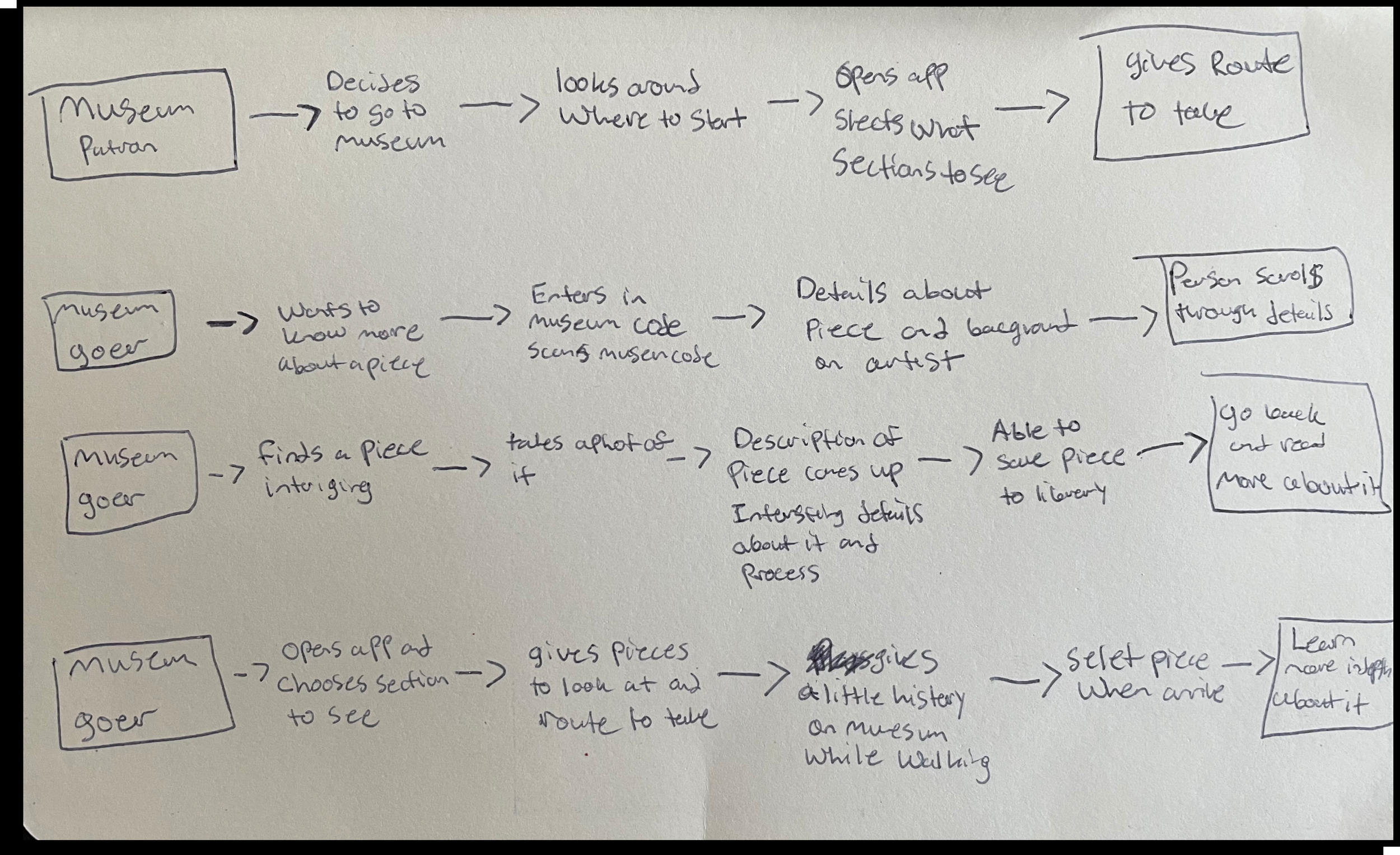
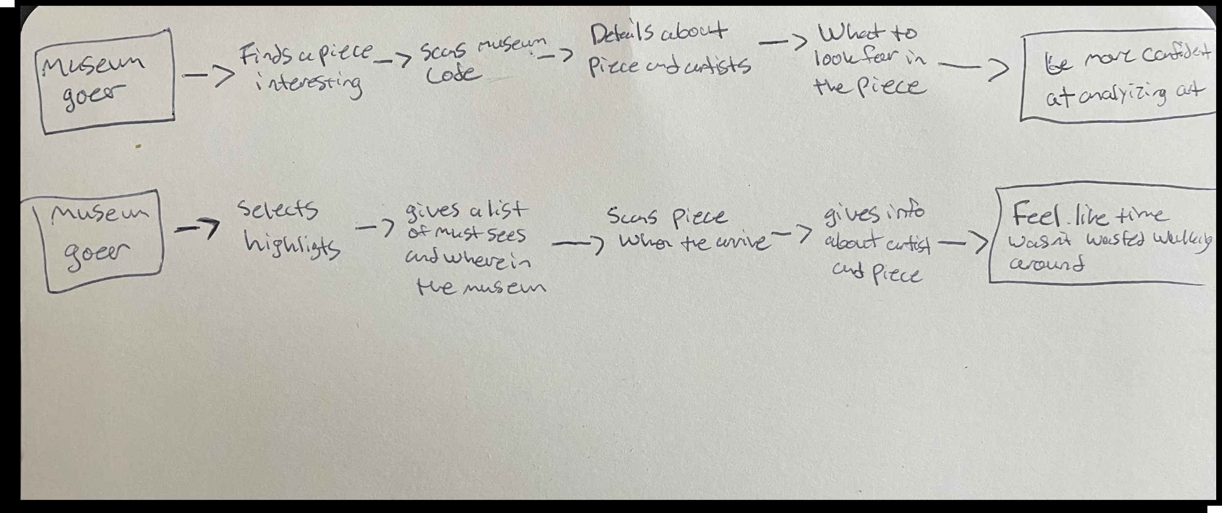
End-to-End User Journeys
Beginning with sketches of end-to-end user journeys helps visualize different paths a user could take in using the app. Also how a user might interact with the app.
Hand Sketches
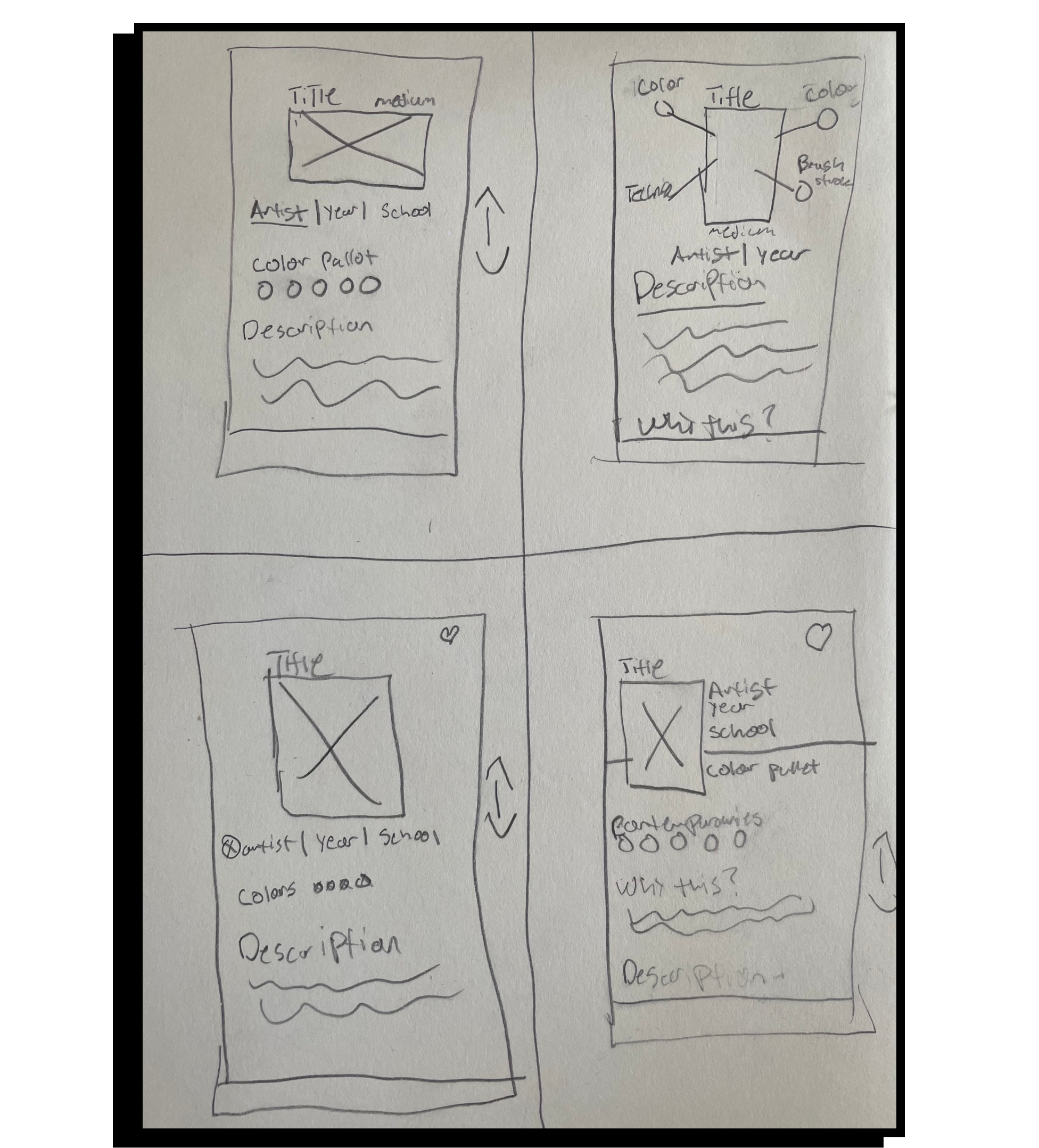
Now comes the fun part. Rough sketches are created as a starting point to help explore, ideate and refine potential solutions. I started with the “crazy 8” sketching exercise where I did 8 sketches in 8 minutes.
Solution Sketches
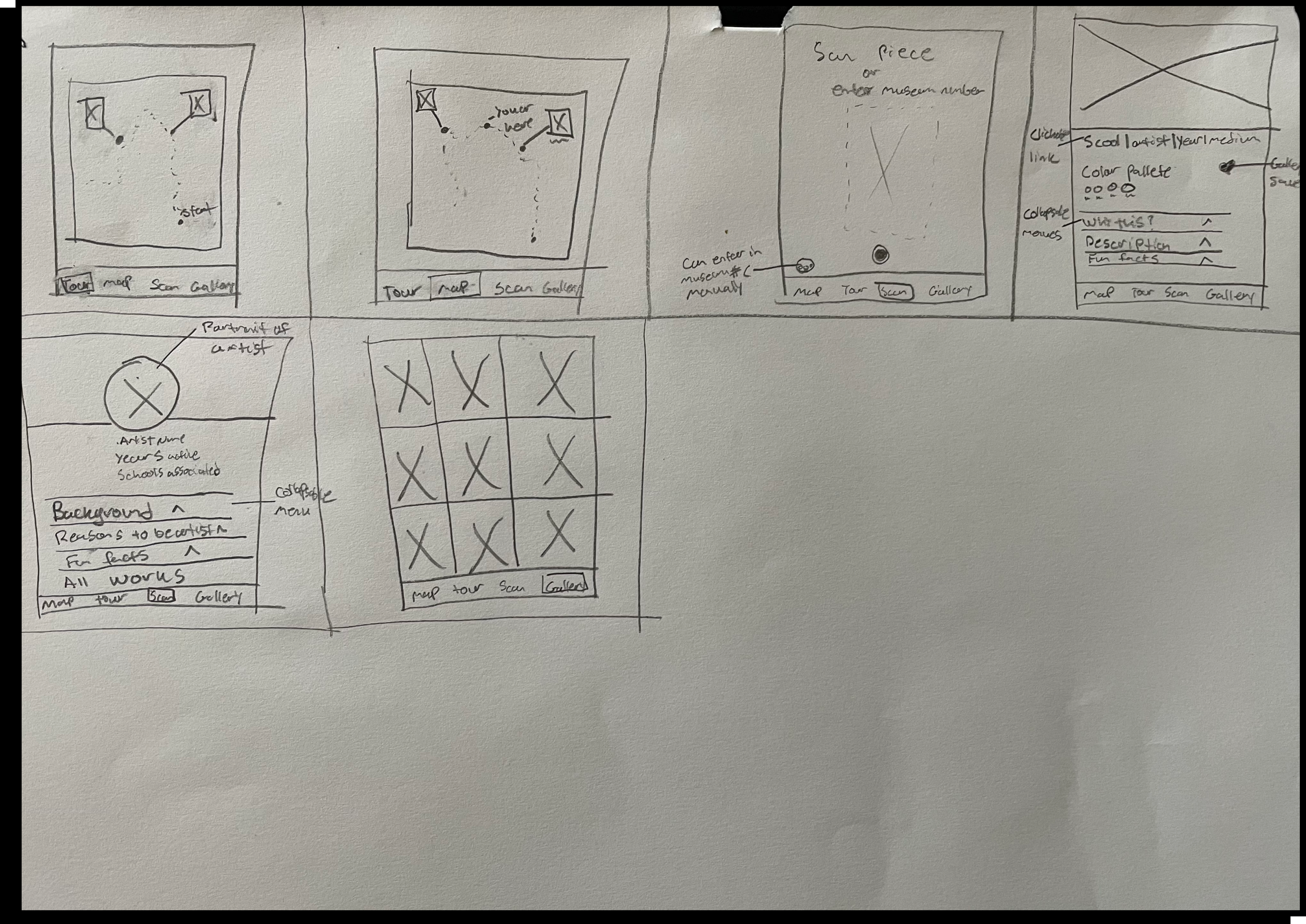
I then chose one sketch from the eight and sketched a layout of what the preceding and proceeding screens would look like.
Chosen Reasons
The main concern of the persona was to “get quick information while looking at art to give her a better appreciation for it”.
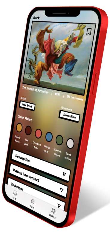
Being able to scan the painting allows the user immediate access to the information. Having the title, artist name, color pallet, and school all there gives a lot of simple information fast. Having the drop-down in the section lets the user see right away what information they have access to. Having access to the gallery map allows the user to make their own tour and the personal gallery allows them to easily pull up information later.
Hi-Fi Mock Up
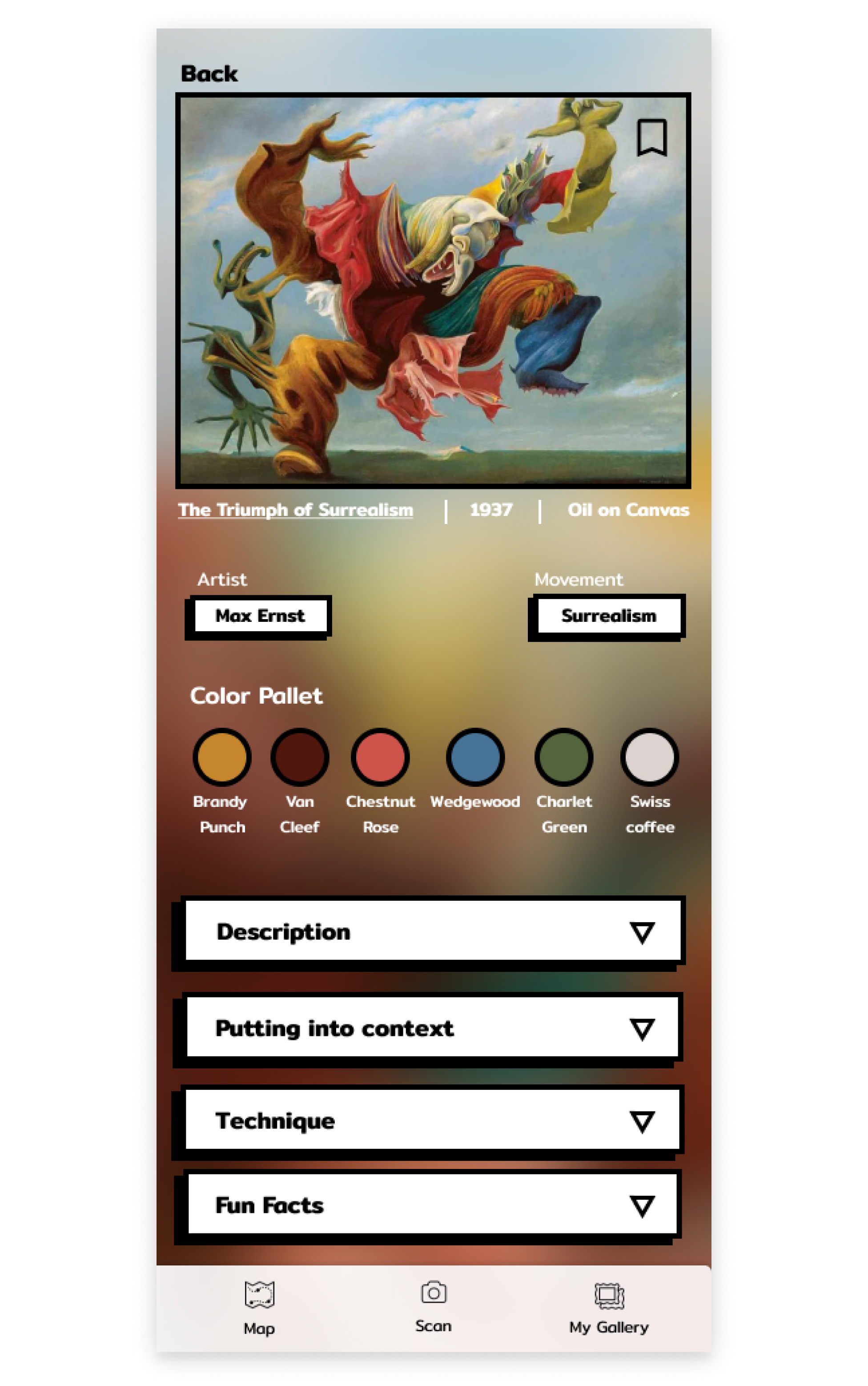
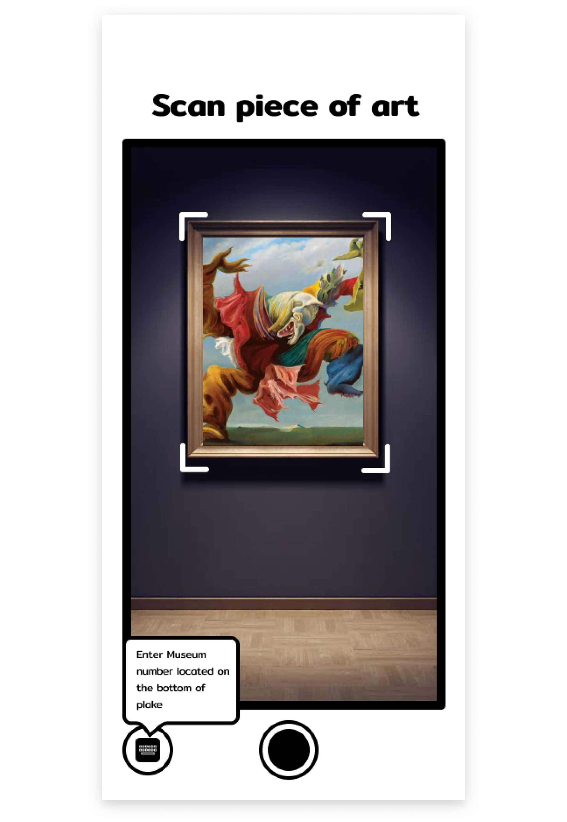
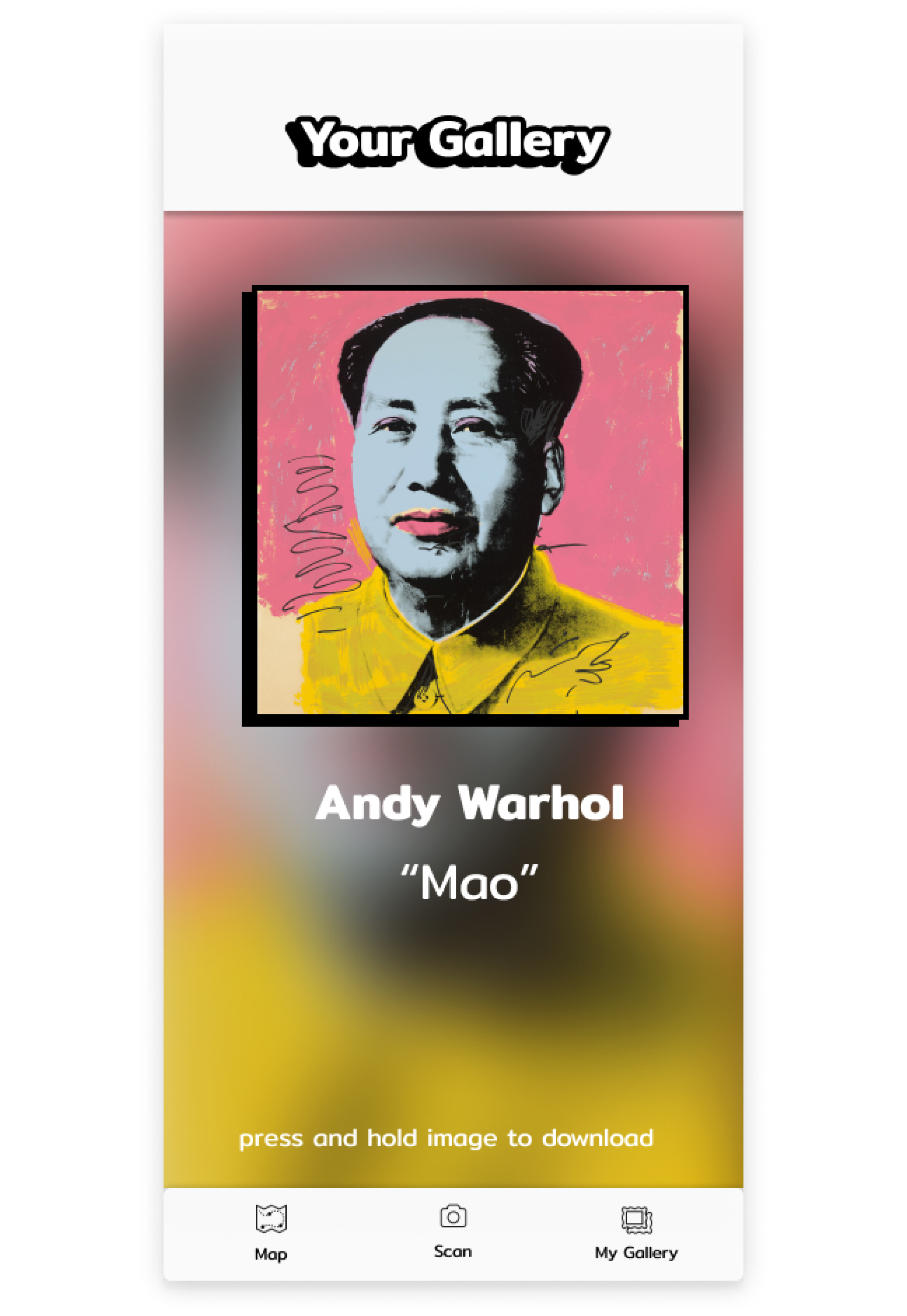
Combining the research provided, sketches, and storyboards I created hi-fi mock-ups, showing how the app would look visually on a phone, but also how the user would interact with it.
Art Piece Screen
Scan Screen
Artist Screen
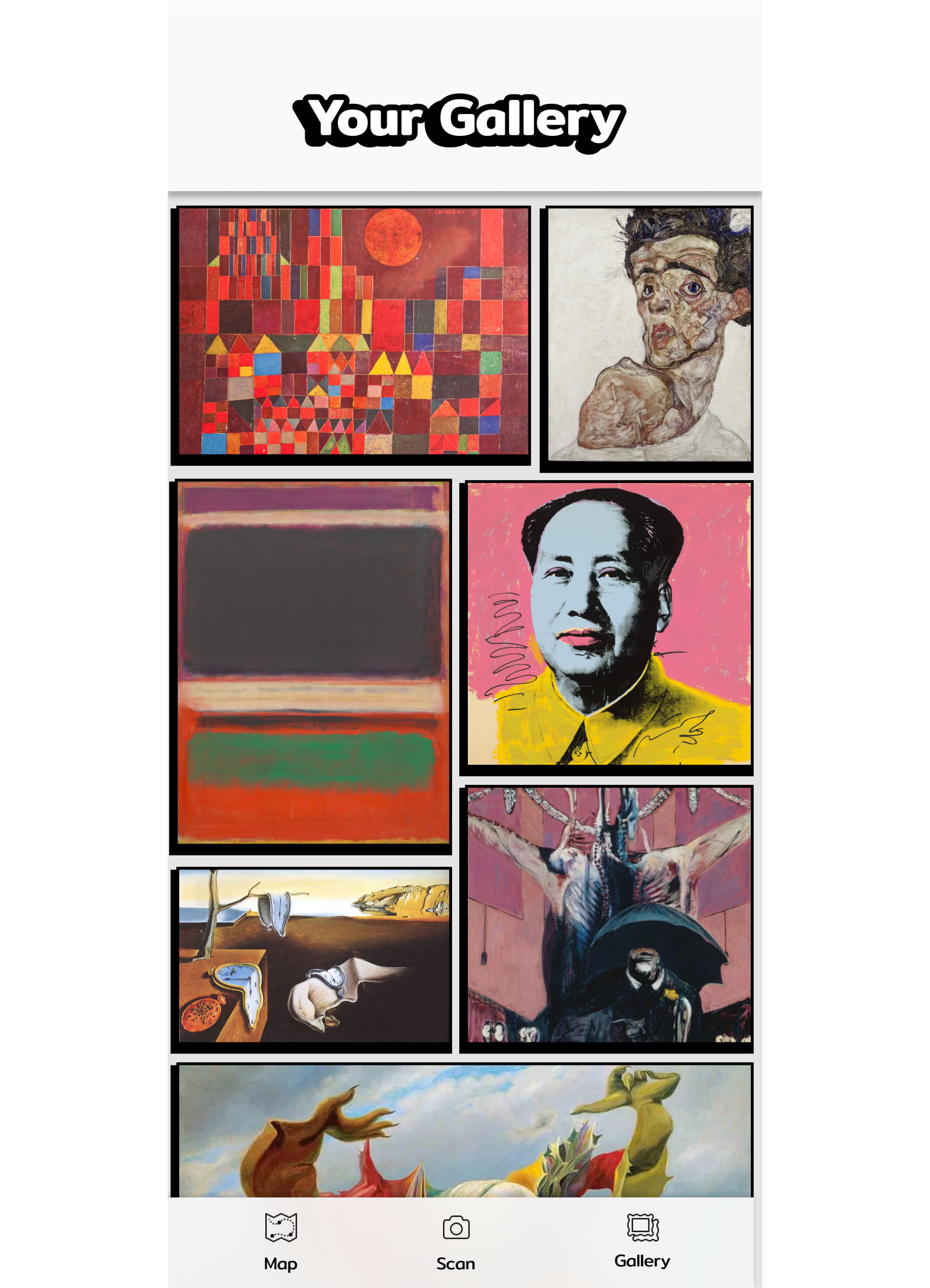
Saved Screen
User Testing/Design Iteration
After gathering insight from user testing, we iterated our designs to reflect the needs and behaviors of our users. Key design changes are illustrated below.
1. Museum number input option
Before
Pain Points
• Doesn't know what a museum number is.
• Unsure of where to find it in the museum.
• Doesn't know why entering the museum number is an option.
After
Iteration
• Take the option off of the scanning screen.
• Create a screen to enter the museum number only if the art is unable to be scanned.
• Add a walk-through of where to find the museum.
Before
Pain Points
• Not sure what to expect under the gallery tab.
• Didn’t know you were able to scroll left or right.
• Unable to see more than 1 piece of art at a time.
After
Iteration
• Change the title of the gallery tab and possibly the icon.
• Add arrows to indicate left/right scrolling
• Re-design gallery page for vertical scrolling.
Conclusions
Final thoughts, outcomes, and lessons from the sprint
Outcomes
Designed a mobile app that allows users to easily search and get information on a piece of art or artist.
Created multiple user flows and options that let the user feel comfortable wandering through a museum without a guide.
Ability to save art pieces and artists to easily recall information.
Lessons
Speed is at the heart of a design sprint and if you are overthinking an idea it is not one worth pursuing further.
Design sprints force you to focus on the core functionality of your product and put the user first.
